
GEM motors
GEM motors Corporate Identity
Visual Identity Redesign for a Technology-Driven Future Moving the Brand Forward
To support GEM motors global ambitions and further emphasise the technological excellence of its products, the company initiated a comprehensive brand identity redesign.
The redesign redefined the entire corporate identity system, aiming to strengthen brand recognition, improve communication clarity, and elevate perceived value. A key creative foundation was the concept of movement, one of the core ideas embedded in the company name GEM – Gibanje (Movement), Elektrika (Electricity), Magnetika (Magnetism). This notion shaped the logo, graphic language, and product design, ensuring consistency across all visual and physical touchpoints.
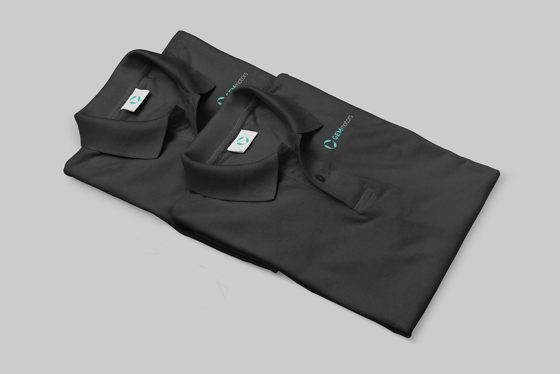
The new logo subtly reflects an abstract electric motor–stator and rotor hidden in negative space and forming a spiral symbolising movement, rotation, and renewability. Alongside the logo redesign, the project included a complete overhaul of the website, development of printed materials, and branding materials. This cohesive visual system ensures consistent brand communication across all platforms and touchpoints, strengthening GEM motors’ presence in the global electric mobility market.
Year: 2019-2020