


Antolin Vrtnarstvo
Antolin Corporate Identity
Rooted in Tradition, Grown into a Brand
Antolin Vrtnarstvo is a local gardening chain with a long-standing tradition, renowned for its commitment to quality and customer care.
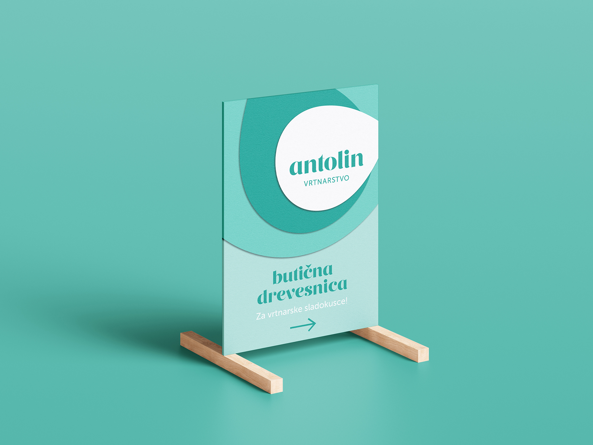
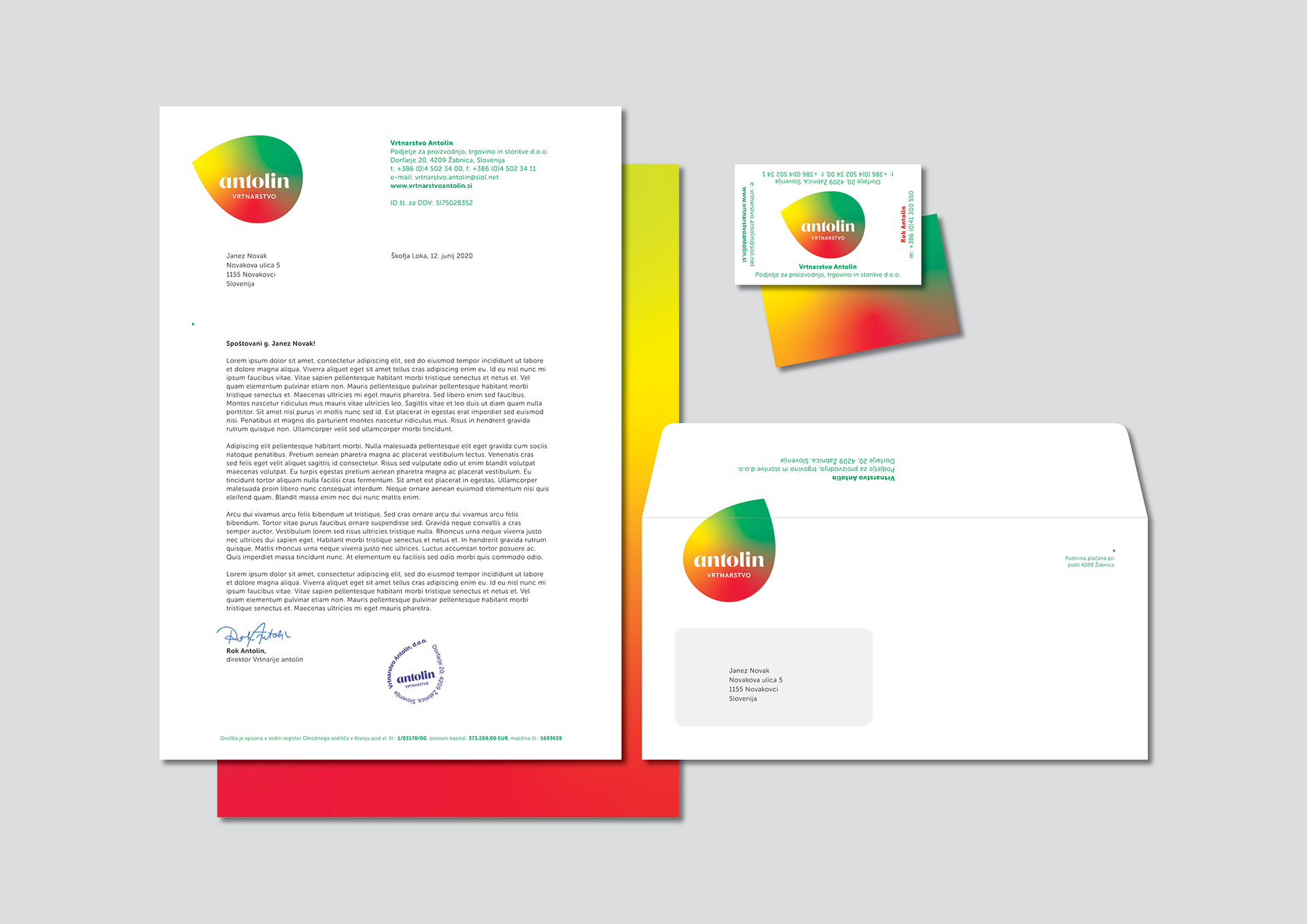
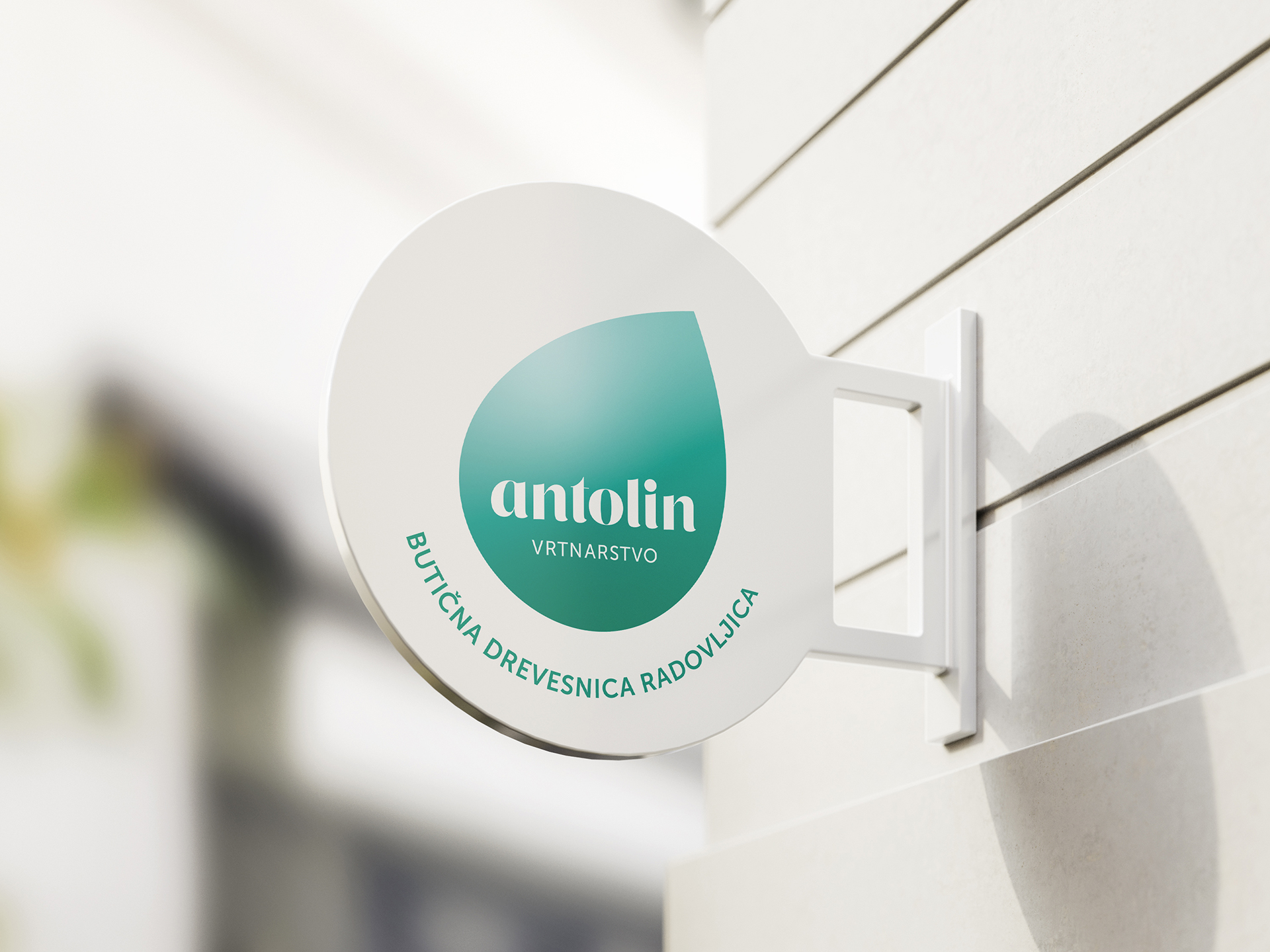
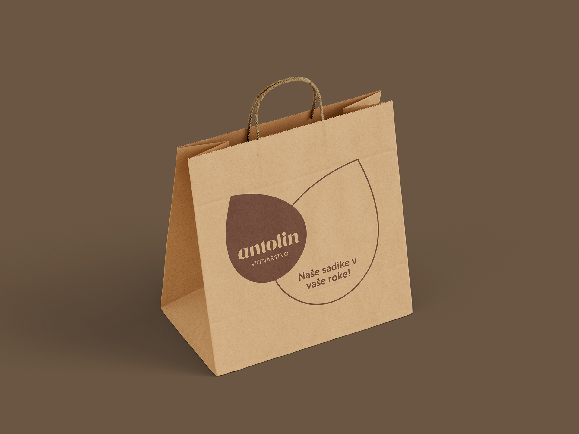
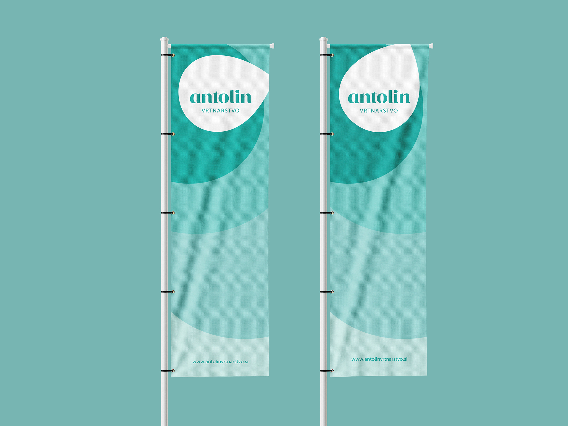
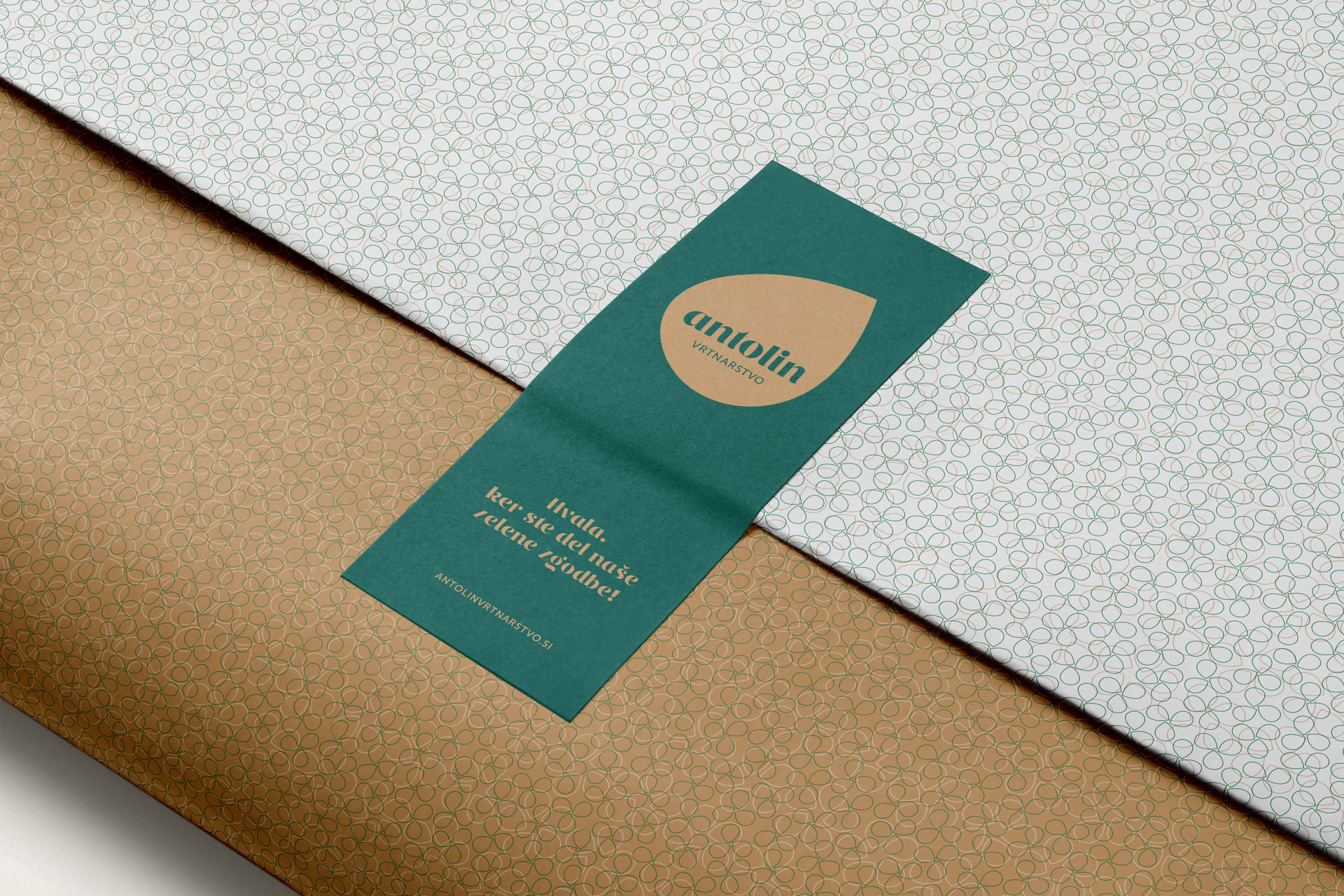
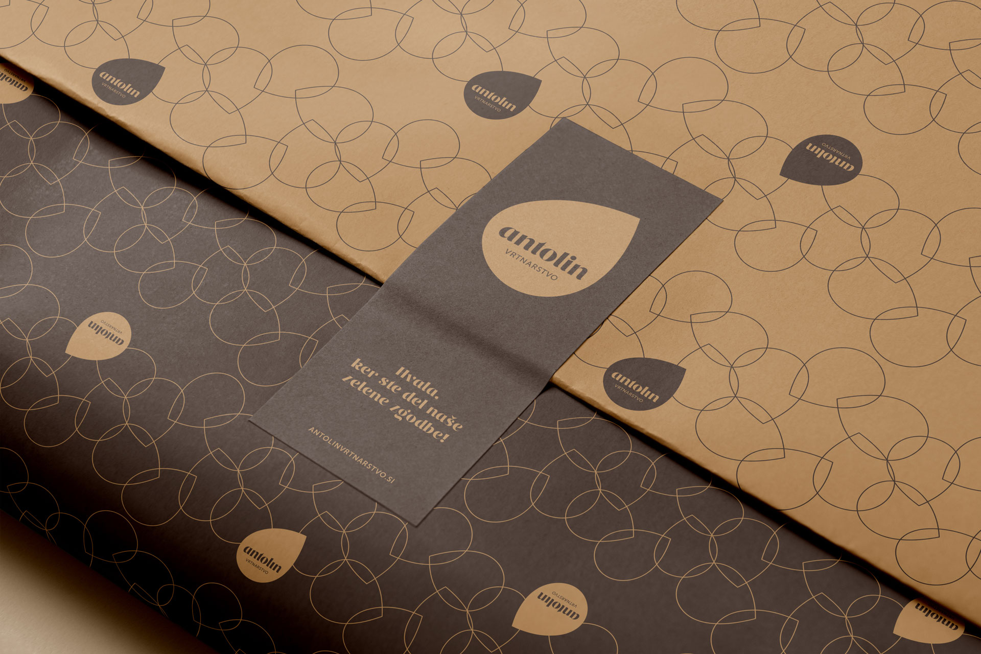
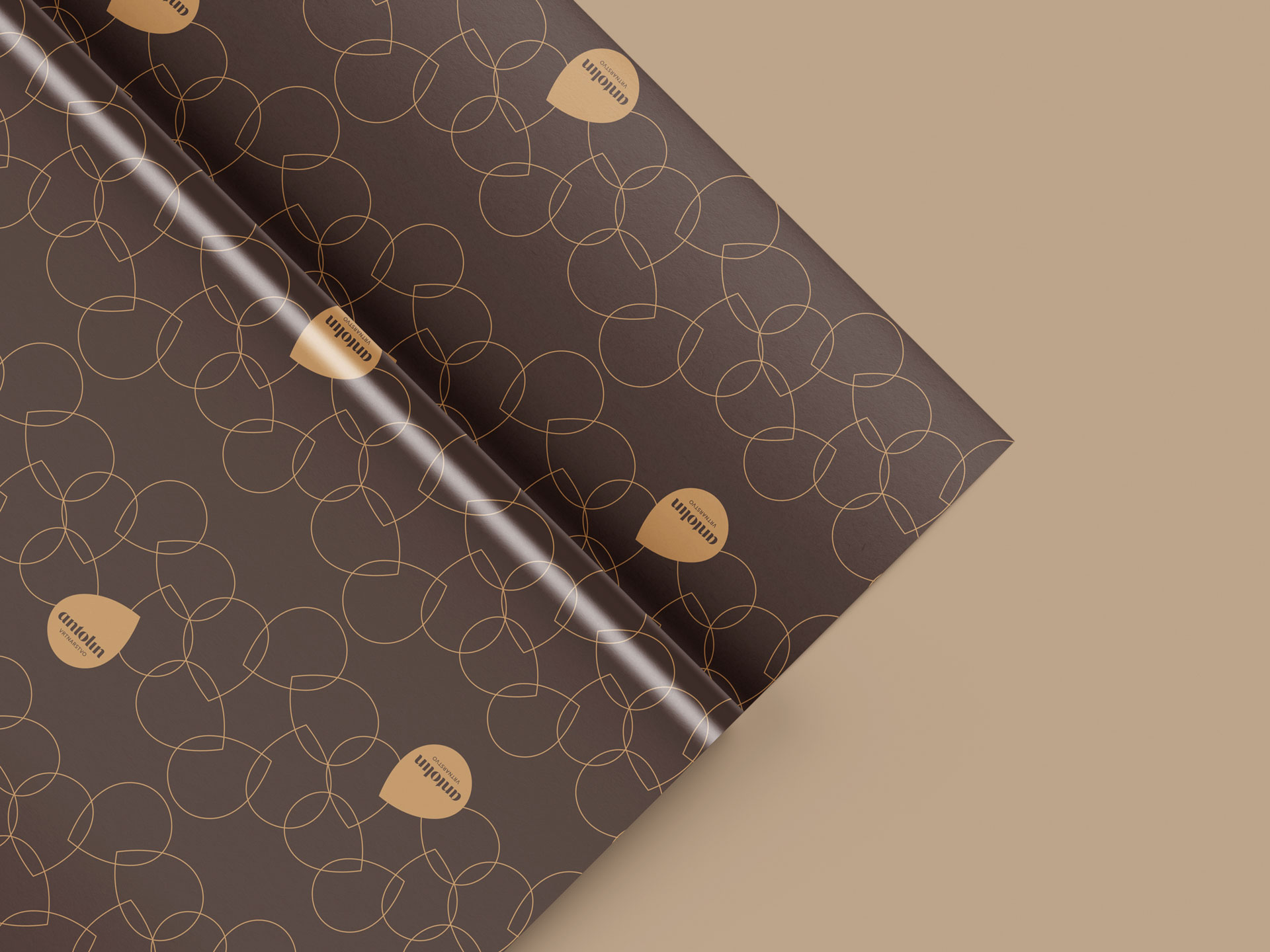
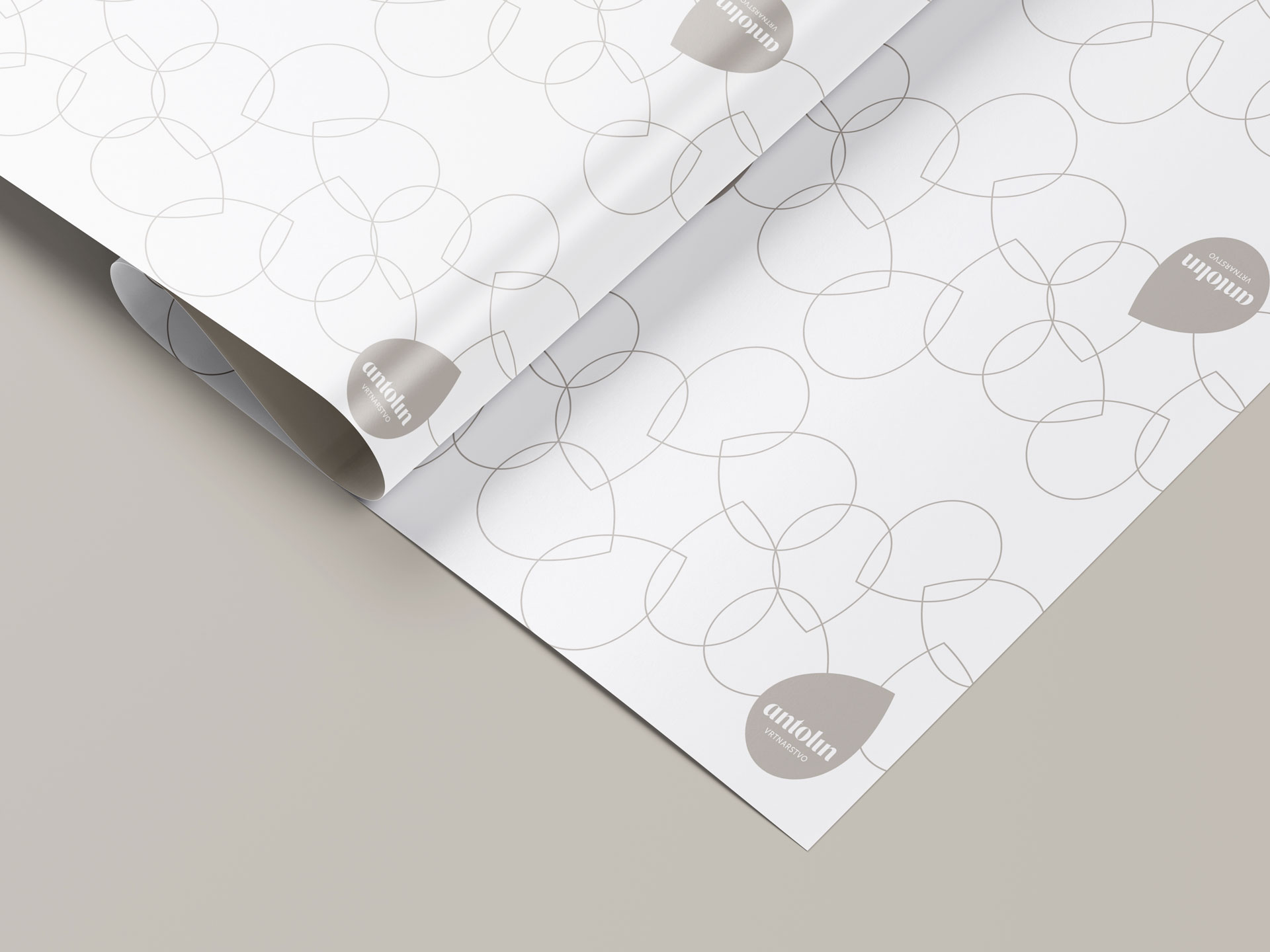
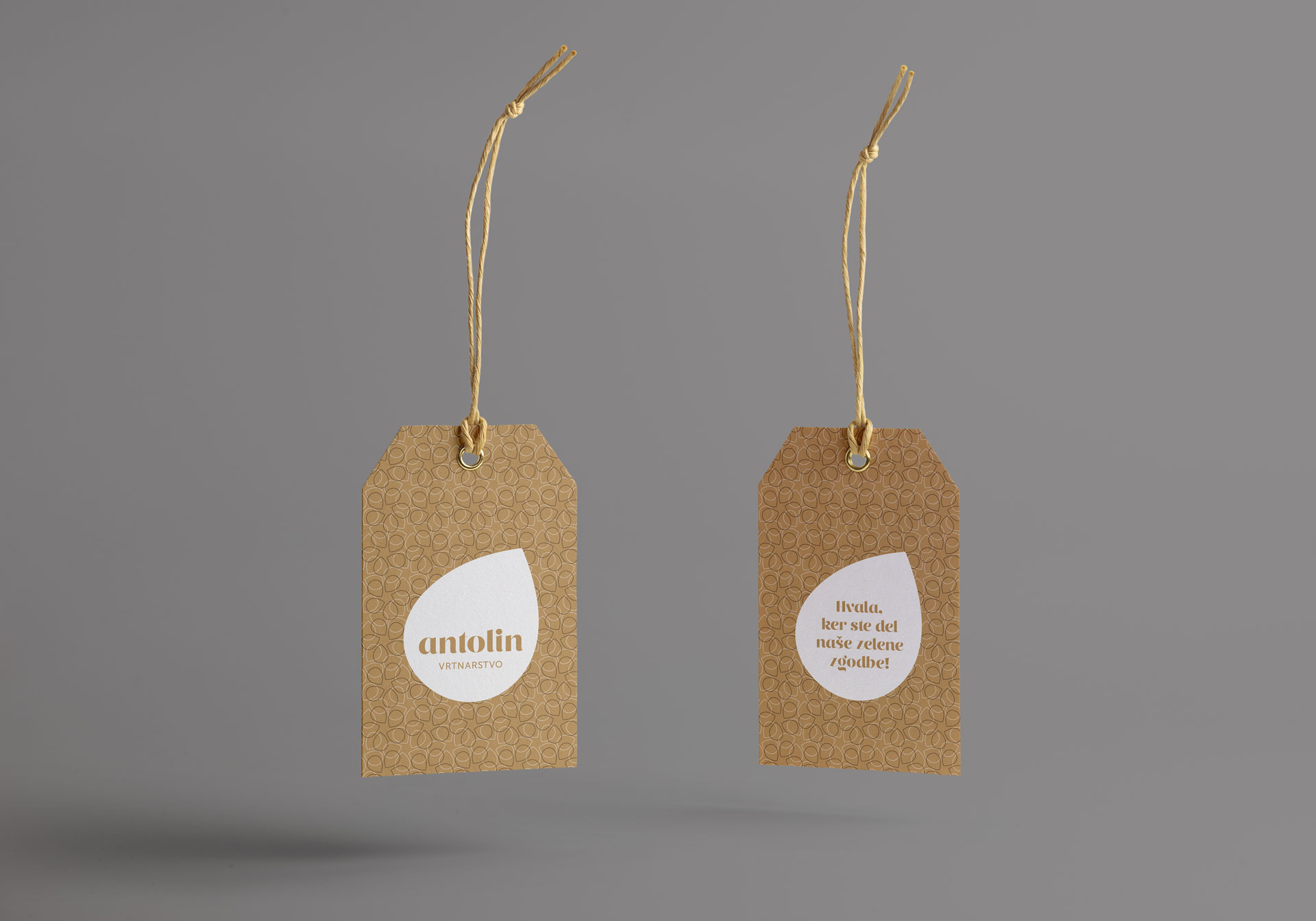
Our rebranding project transtormed Antolin trom a traditional, family-run garden business into a modern, recognisable brand-enhancing the customer experience and reinforcing brand loyalty through a more inviting, coherent, and professional identity. The visual identity is built around a simple ver a sunctive mour: the leaf. This symbol not only evokes growth and nature, but also reflects Antolin’s unique selling point – they don’t just sell plants, they grow them locally. This ensures their plants are more resent and better suited to the regional climate. The identity system is designed with built-in flexibility and a sense of playfulness, allowing it to adapt across various contexts while maintaining a consistent brand presence. Applications extend well beyond basic stationery and aila presence: the new identity is applied across apparel, interior design. packaging. signage systems, marketing materials. and social media – creating a unique experience across all touchpoints.
Year: 2020 –